Dragonfresh
Dragonfresh
Usability Improvements
Usability Improvements
Time: 2021 July - Aug
Tool: Figma, Illustrator, Miro
Contribution: Usability Testing, UIUX Design
Time: 2021 July - Aug
Tool: Figma, Illustrator, Miro
Contribution: Usability Testing, UIUX Design
Overview
Dragonfresh Seafood is an online grocery shopping platform. Starting with group sale business mode, they have raised a group of reliable customers in Bay Area from Wechat group. Last year they lauched their app and website to improve user engagement.
Dragonfresh Seafood is an online grocery shopping platform. Starting with group sale business mode, they have raised a group of reliable customers in Bay Area from Wechat group. Last year they lauched their app and website to improve user engagement.
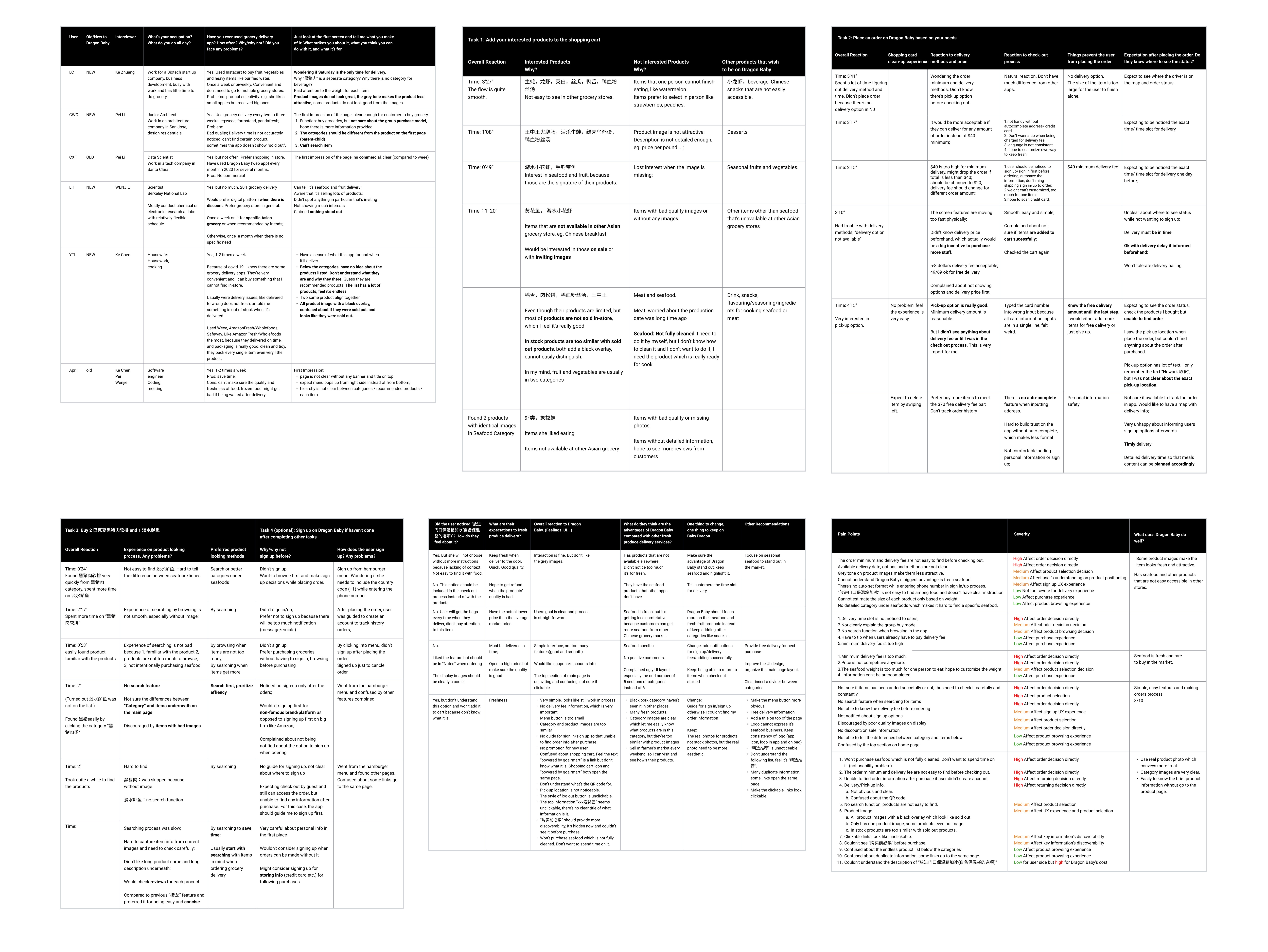
We helped the product team conduct the usability testing with 6 users and generated testing report with heuristic evaluation from usability and marketing perspectives. Based on the research findings, we redesigned browse, shopping cart and check-out pages and also provides branding design considering both usability and accessibility.
Usability Testing
Usability Testing
Testing Objectives
Testing Objectives
This testing focuses on the user experience of Dragonfresh mobile app. Based on the clients’ requests and general usability requirements, the following testing objectives guided the design and methodology of the test.
This testing focuses on the user experience of Dragonfresh mobile app. Based on the clients’ requests and general usability requirements, the following testing objectives guided the design and methodology of the test.
Testing Methodology
Testing Methodology
Each user testing session started with goal introduction from moderator to participant, followed up with pre-testing interview questions to clarify user’s background information and warm up for testing. Then the moderator let participant open Dragonfresh mobile app, browse the first page and provide feedback. After that the participant was asked to complete 4 tasks around browsing, placing an order and searching for specific product. Each task is associated with related follow-up questions. After completing all tasks, post-testing questions were asked by the moderator to close the session.
Each user testing session started with goal introduction from moderator to participant, followed up with pre-testing interview questions to clarify user’s background information and warm up for testing. Then the moderator let participant open Dragonfresh mobile app, browse the first page and provide feedback. After that the participant was asked to complete 4 tasks around browsing, placing an order and searching for specific product. Each task is associated with related follow-up questions. After completing all tasks, post-testing questions were asked by the moderator to close the session.
Participants
Participants
We recruited 4 new users and 2 return users. For new users we focused on testing the onboarding experience, first impression on the app and things driving them placing the first order. For return users we asked their previous order experience and delivery feedback especially on insulation bags according to the client’s request.
We recruited 4 new users and 2 return users. For new users we focused on testing the onboarding experience, first impression on the app and things driving them placing the first order. For return users we asked their previous order experience and delivery feedback especially on insulation bags according to the client’s request.
Usability Testing Data
Usability Testing Data
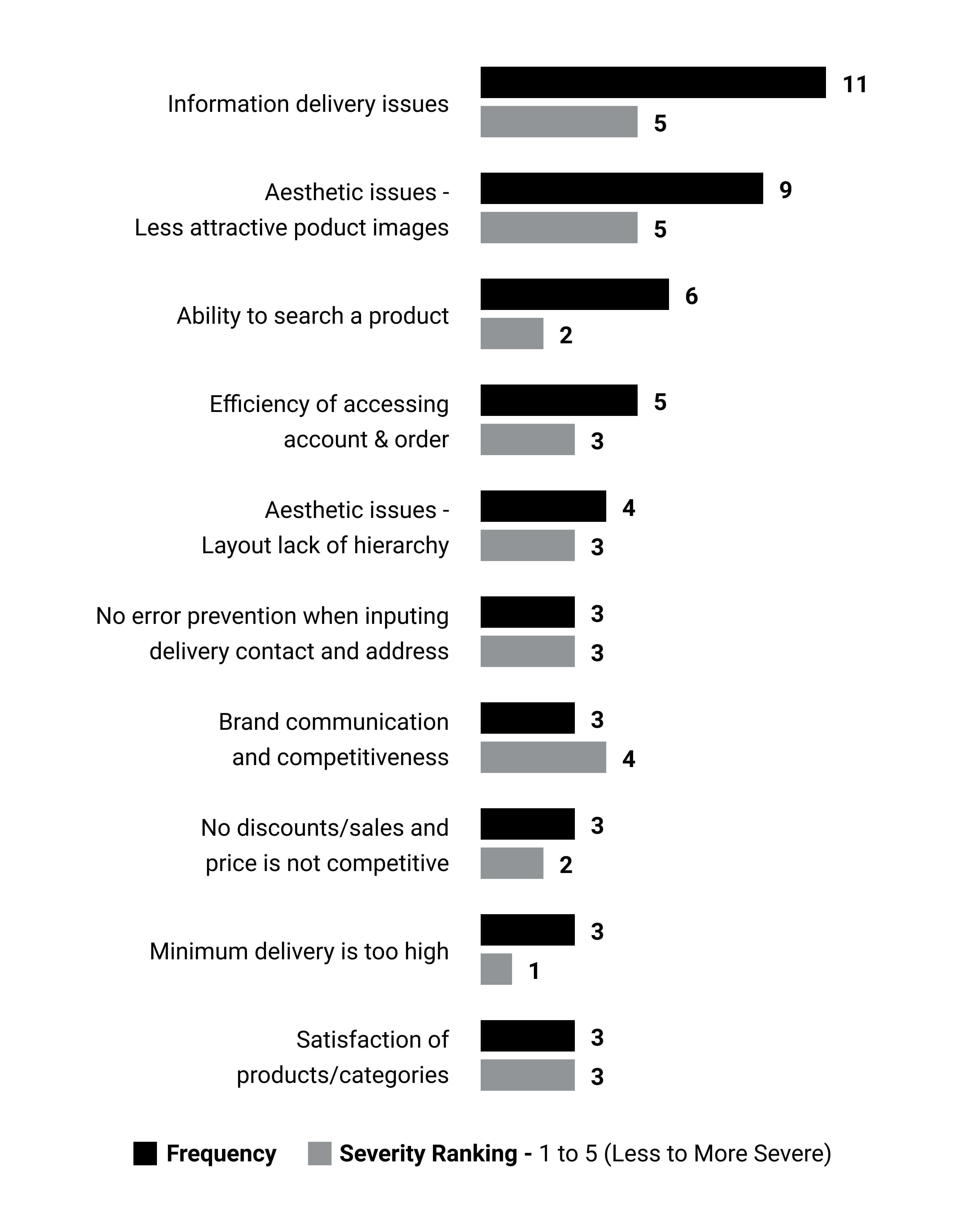
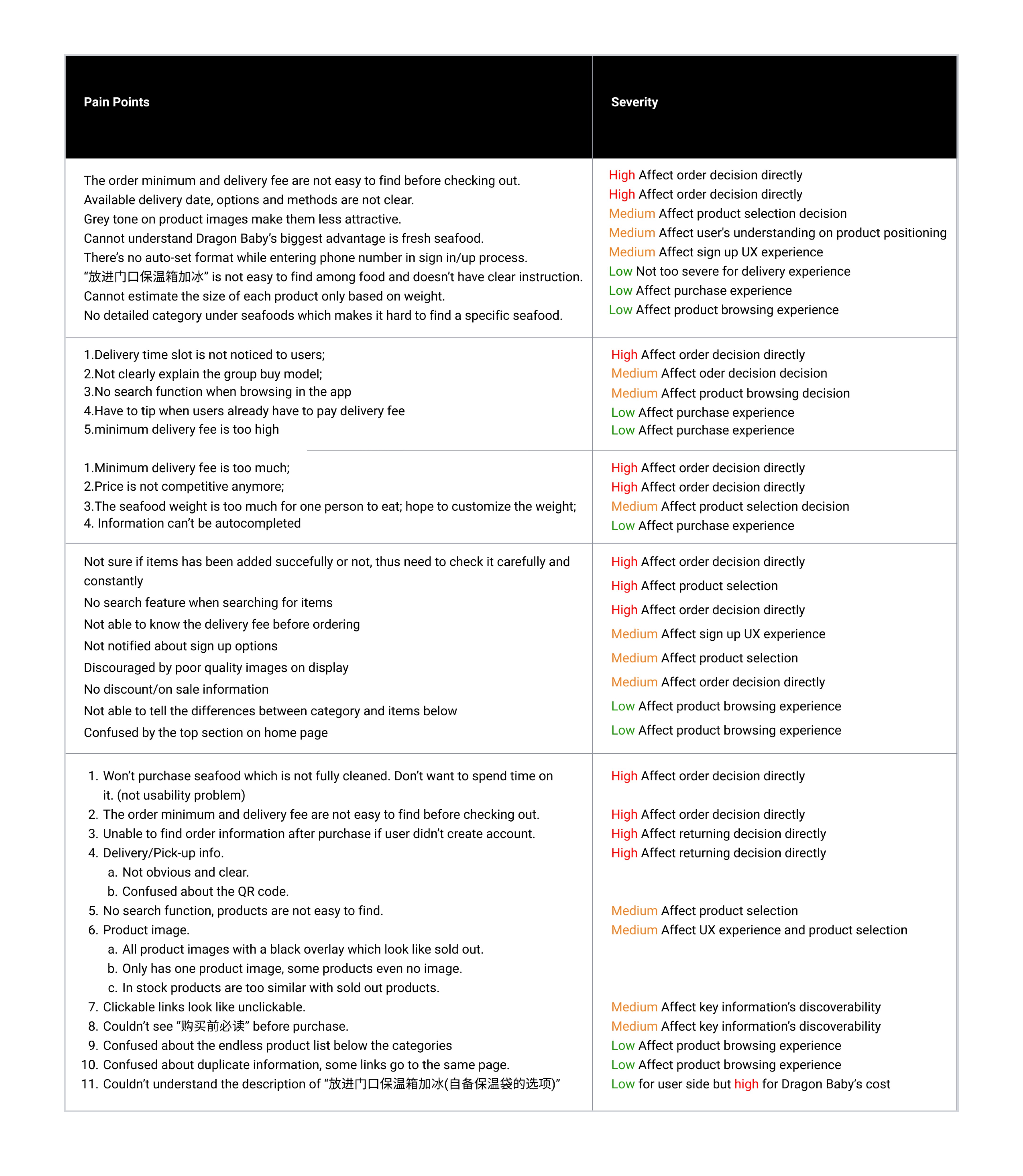
After testing 6 users with 4 tasks and several follow-up questions, we listed and synced all the data based on the usability testing process to clearly analyze the pain points. We prioritized the pain points both “affecting order decision“ and “experience of using Dragonfresh“ by frequency and severity.
After testing 6 users with 4 tasks and several follow-up questions, we listed and synced all the data based on the usability testing process to clearly analyze the pain points. We prioritized the pain points both “affecting order decision“ and “experience of using Dragonfresh“ by frequency and severity.
Pain Points Prioritization
Pain Points Prioritization
The pain points with high affect should be addressed first by redesigning Dragonfresh app. So we focused on browsing and checking out process redesign to improve user experience of shopping grocery online and placing order.
The pain points with high affect should be addressed first by redesigning Dragonfresh app. So we focused on browsing and checking out process redesign to improve user experience of shopping grocery online and placing order.
Findings & Recommendations
Findings & Recommendations
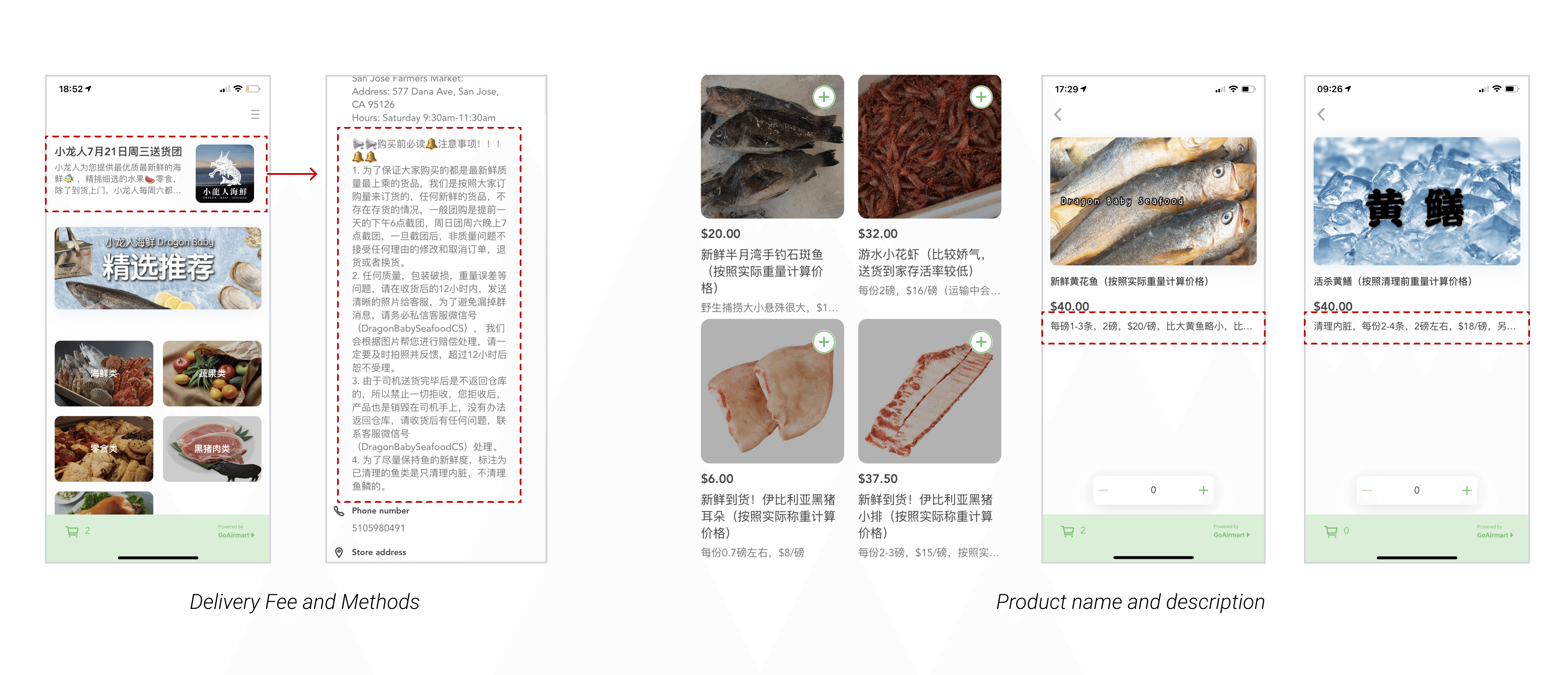
Finding 1. Users had difficulty seeing key information: announcement, delivery-related information, and product description.
Finding 1. Users had difficulty seeing key information: announcement, delivery-related information, and product description.
Two participants who live nearby showed interest in the pick-up option, but all participants complained the delivery fee and methods are only knowable until checking out.
Participants are confused about some contents because they're omitted with the ellipsis.
Two participants who live nearby showed interest in the pick-up option, but all participants complained the delivery fee and methods are only knowable until checking out.
Participants are confused about some contents because they're omitted with the ellipsis.
Recommendation 1. Conveying the information clearly and efficiently to users.
Recommendation 1. Conveying the information clearly and efficiently to users.
Displaying key information or giving access to it at the top of the home page.
Prioritizing and reorganizing information on item detail page.
Displaying key information or giving access to it at the top of the home page.
Prioritizing and reorganizing information on item detail page.
Finding 2. Less attractive product images affect users' buying interest.
Finding 2. Less attractive product images affect users' buying interest.
At the first glance, users are attracted by products with high quality images, especially those with ice indicating the product is fresh.
At the first glance, users are attracted by products with high quality images, especially those with ice indicating the product is fresh.
Recommendation 2. Using original images and removing the grey overlay will make customers more interested in the product.
Recommendation 2. Using original images and removing the grey overlay will make customers more interested in the product.
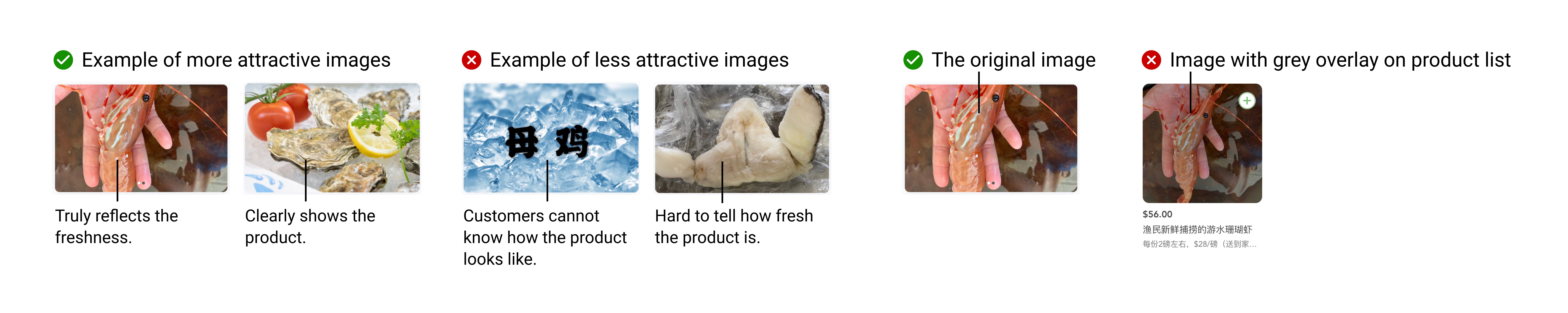
“The dark filter makes me think the product is sold out. ” - New User
“The dark filter makes me think the product is sold out. ” - New User
Finding 3. Users had difficulty looking for items without a search feature.
Finding 3. Users had difficulty looking for items without a search feature.
Upon being prompted to look for a specific item, users immediately started looking for search feature.
Users need to figure out the availability of items in the first place.
Not all users would be browsing all products.
Upon being prompted to look for a specific item, users immediately started looking for search feature.
Users need to figure out the availability of items in the first place.
Not all users would be browsing all products.
Recommendation 3. Incorporate a search bar on the homepage.
Recommendation 3. Incorporate a search bar on the homepage.
A clear and prominent search bar at homepage will clearly communicate to users that they are able to look for items in Dragon Baby with options they prefer, thus leading to a more smooth ordering experience.
It will also significantly save users’ time, which is the primary reason for 30% users to order food delivery online.

“I’m doing online shopping to save time, whereas it cost me more time without being able to search for what I want.” - New User
“I’m doing online shopping to save time, whereas it cost me more time without being able to search for what I want.” - New User
Finding 4. Information like address can’t be autocompleted or corrected when checking out.
Finding 4. Information like address can’t be autocompleted or corrected when checking out.
No error notification showing when information is wrong.
No error notification showing when information is wrong.
Recommendation 4. Autocomplete when filling information like address for checking out.
Recommendation 4. Autocomplete when filling information like address for checking out.
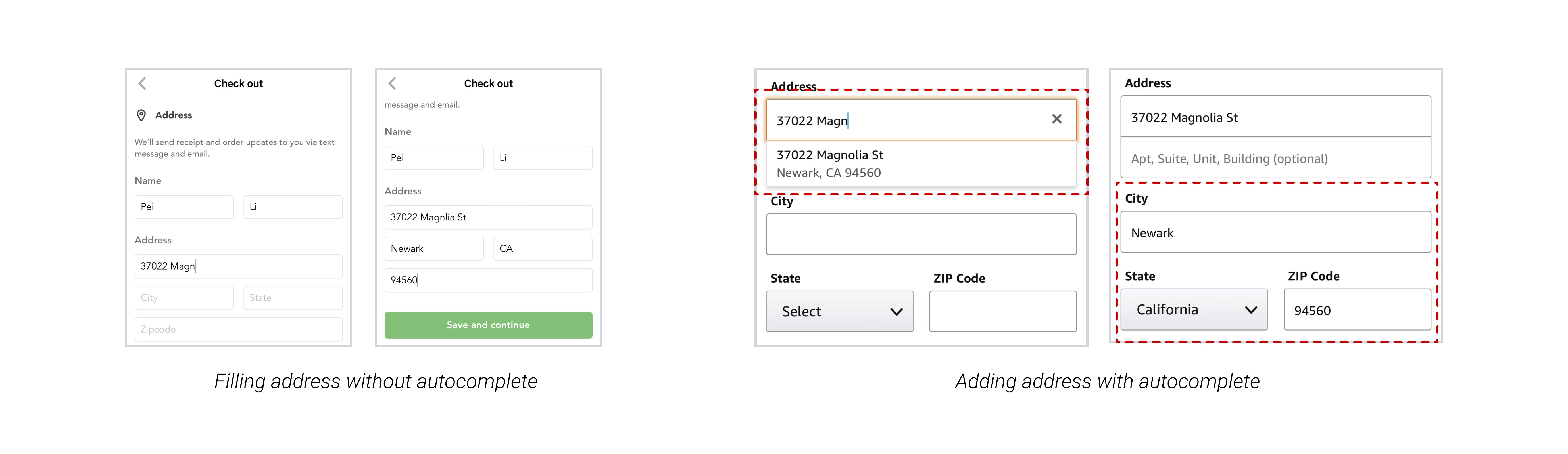
“Who should we blame if I accidently add the wrong address and my grocery is delivered there” - Old User
“Who should we blame if I accidently add the wrong address and my grocery is delivered there” - Old User
Product Redesign
Product Redesign
With usability testing findings and recommendations, we decided to focus on redesigning browsing, shopping cart and check out pages. Considering the interaction and accessibility, we also provided branding graphic design including logo and color palette.
With usability testing findings and recommendations, we decided to focus on redesigning browsing, shopping cart and check out pages. Considering the interaction and accessibility, we also provided branding graphic design including logo and color palette.
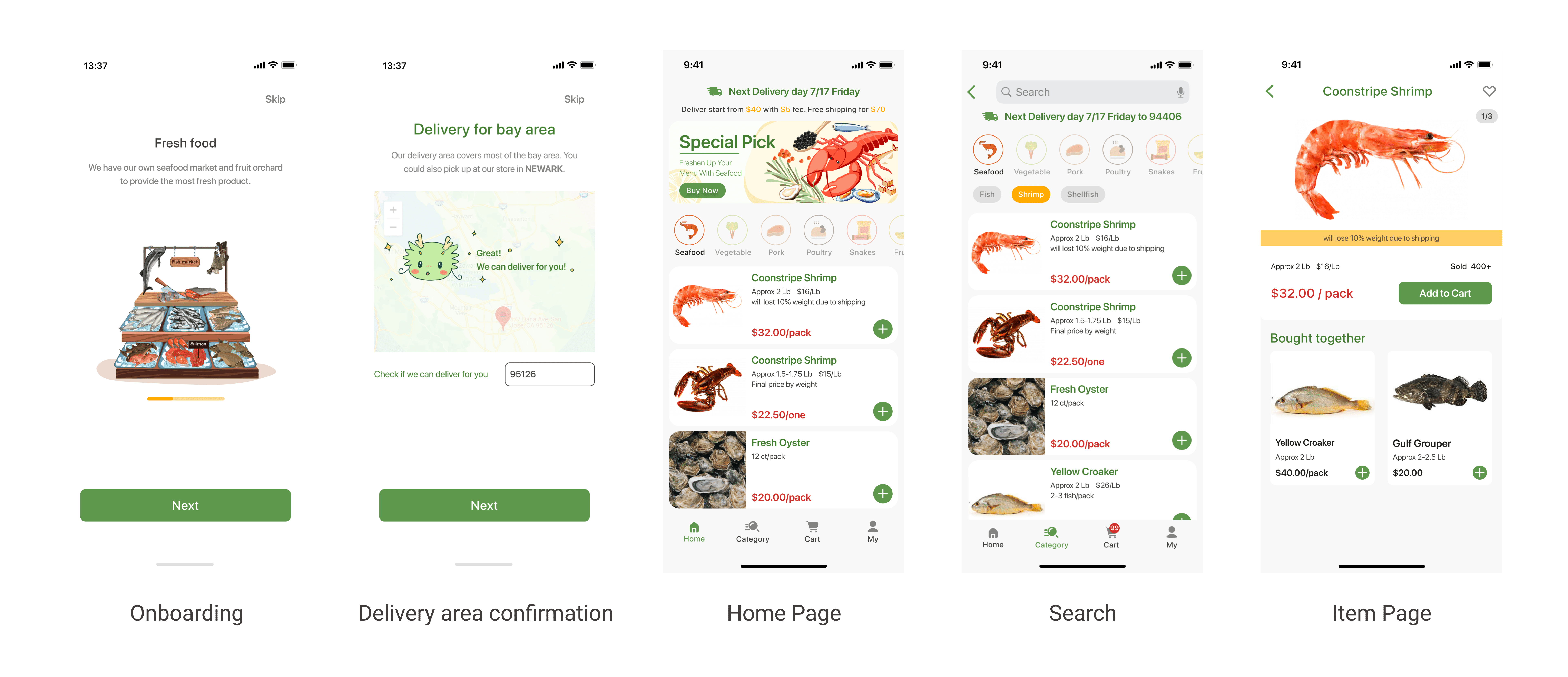
Browse
Browse
Food categories helps users search the item they want.
Adding item motion design improves the shopping experience with more interaction.
More item info showing on home page saves more time when users are browsing.
Food categories helps users search the item they want.
Adding item motion design improves the shopping experience with more interaction.
More item info showing on home page saves more time when users are browsing.
Item Info
Item Info
More attracting pictures of item increase the possibility of purchasing.
Users are able to make better decision with more detailed info including price per pound and the sold amount.
More attracting pictures of item increase the possibility of purchasing.
Users are able to make better decision with more detailed info including price per pound and the sold amount.
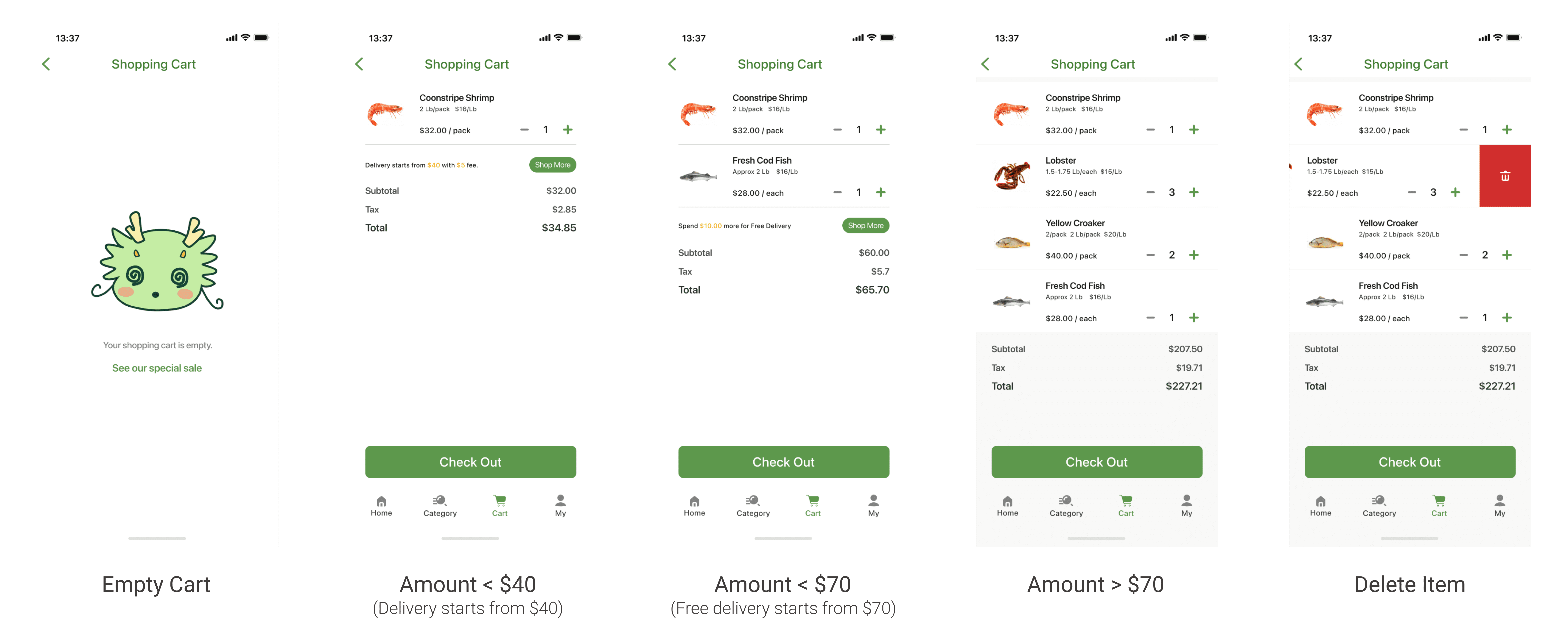
Shopping Cart
Shopping Cart
Shopping cart overview with price detail info avoids double checking by returning to item page.
Users will be notified with more info of delivery fee based on the total amount.
Shopping cart overview with price detail info avoids double checking by returning to item page.
Users will be notified with more info of delivery fee based on the total amount.
Check-out
Check-out
Auto-completing address improves the efficency of placing an order and avoids the wrong address issue.
Successfully placing order message improves the shopping experience with fun interaction.
Auto-completing address improves the efficency of placing an order and avoids the wrong address issue.
Successfully placing order message improves the shopping experience with fun interaction.

Branding
Logo Design
Logo Design
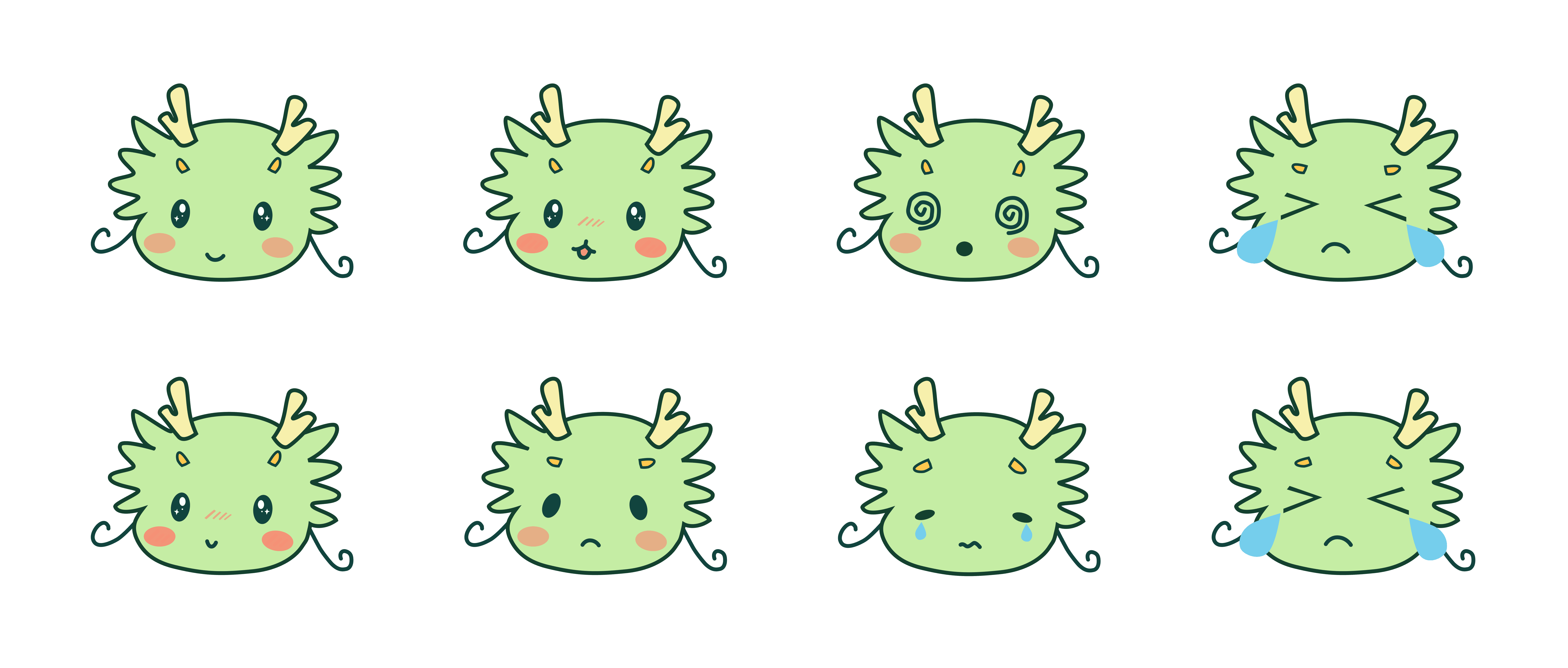
Based on the name of this app, we redesigned the logo and accommodated it into UI design with interaction.
Based on the name of this app, we redesigned the logo and accommodated it into UI design with interaction.
Color Palette
Color Palette
Considering the accessibility, we kept the green tone brand color but adjust it with higher color contrast and added more colors for different purposes.
Considering the accessibility, we kept the green tone brand color but adjust it with higher color contrast and added more colors for different purposes.

Design Guideline
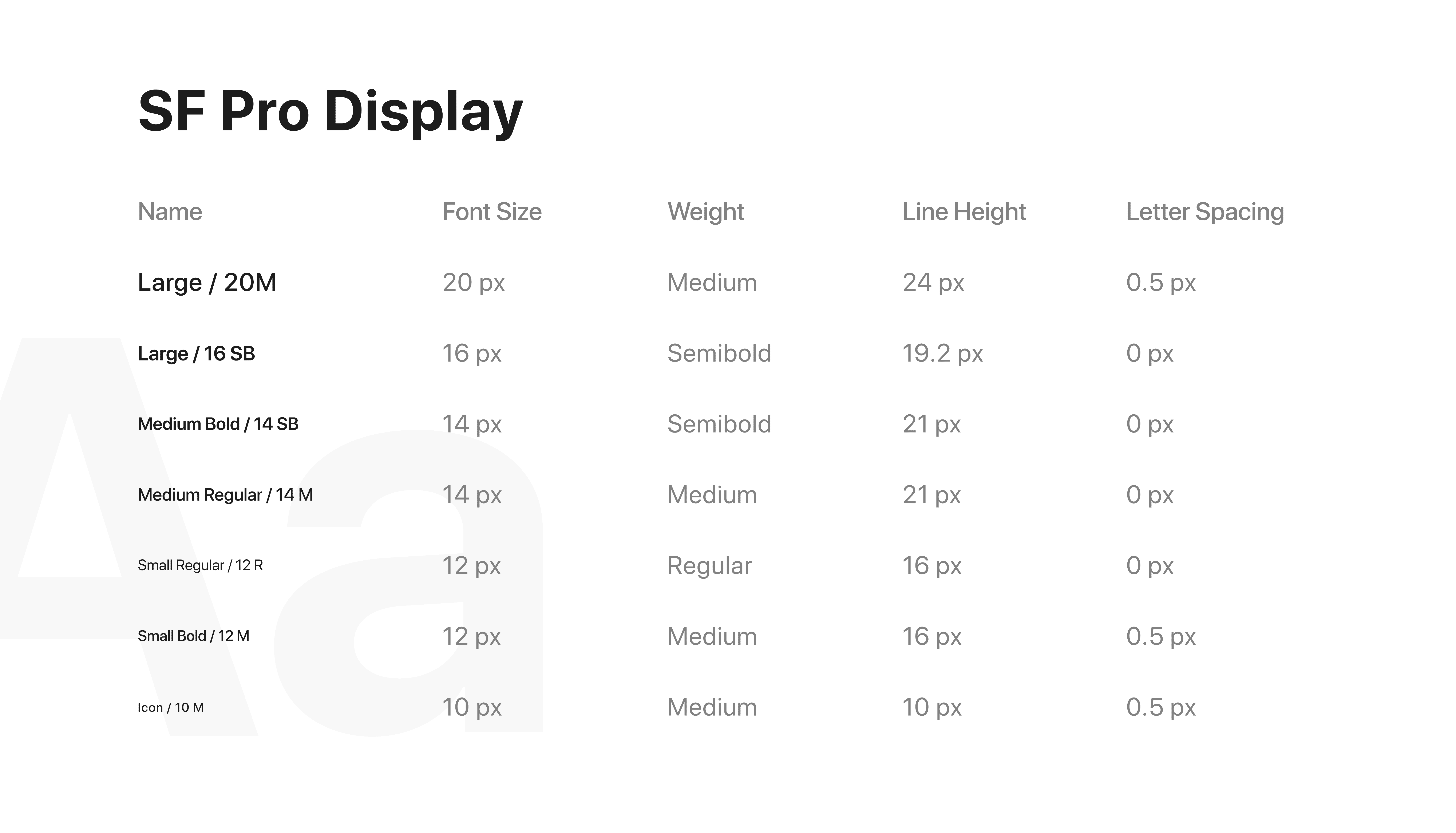
Typography
Typography
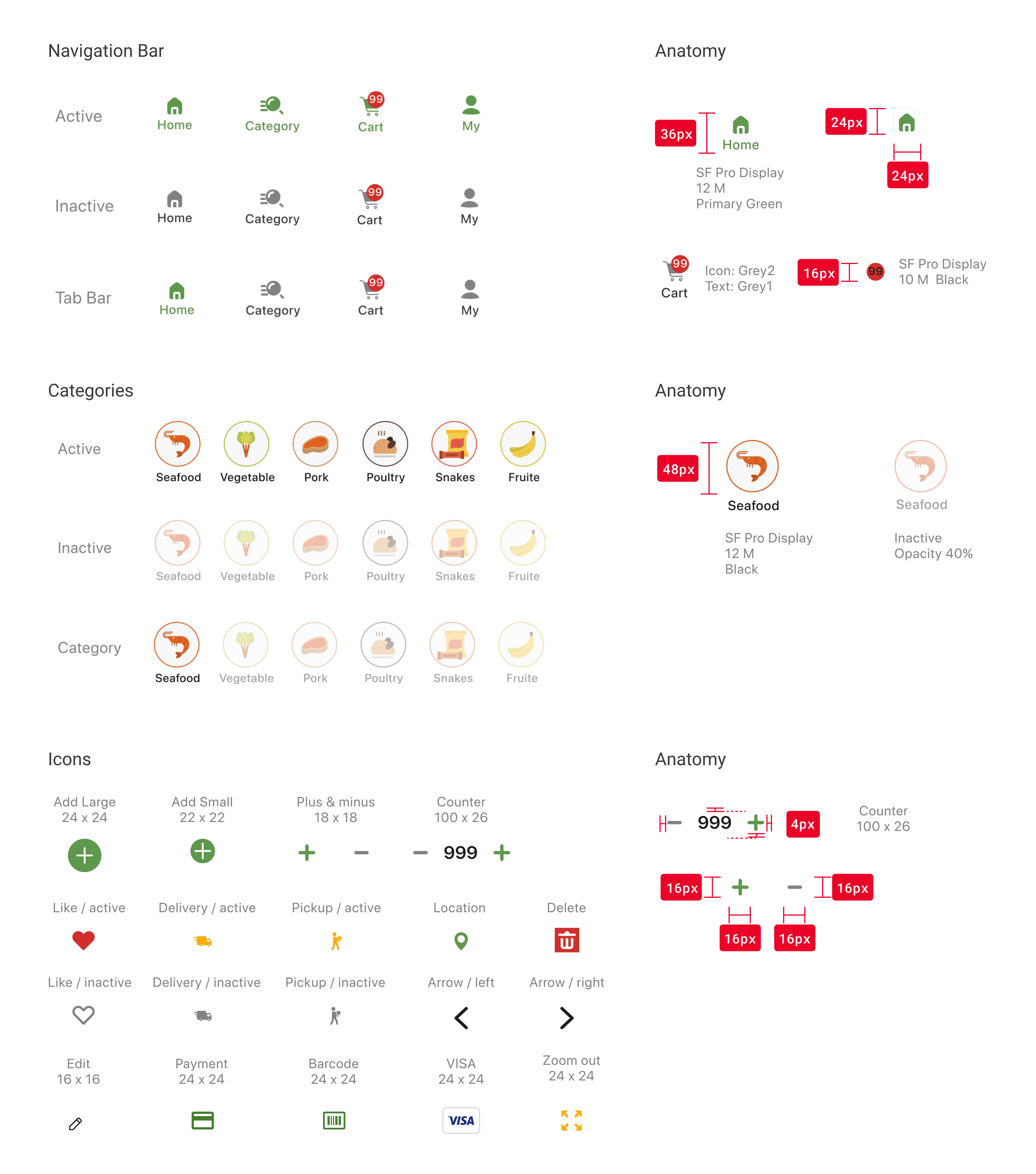
Iconography
Iconography
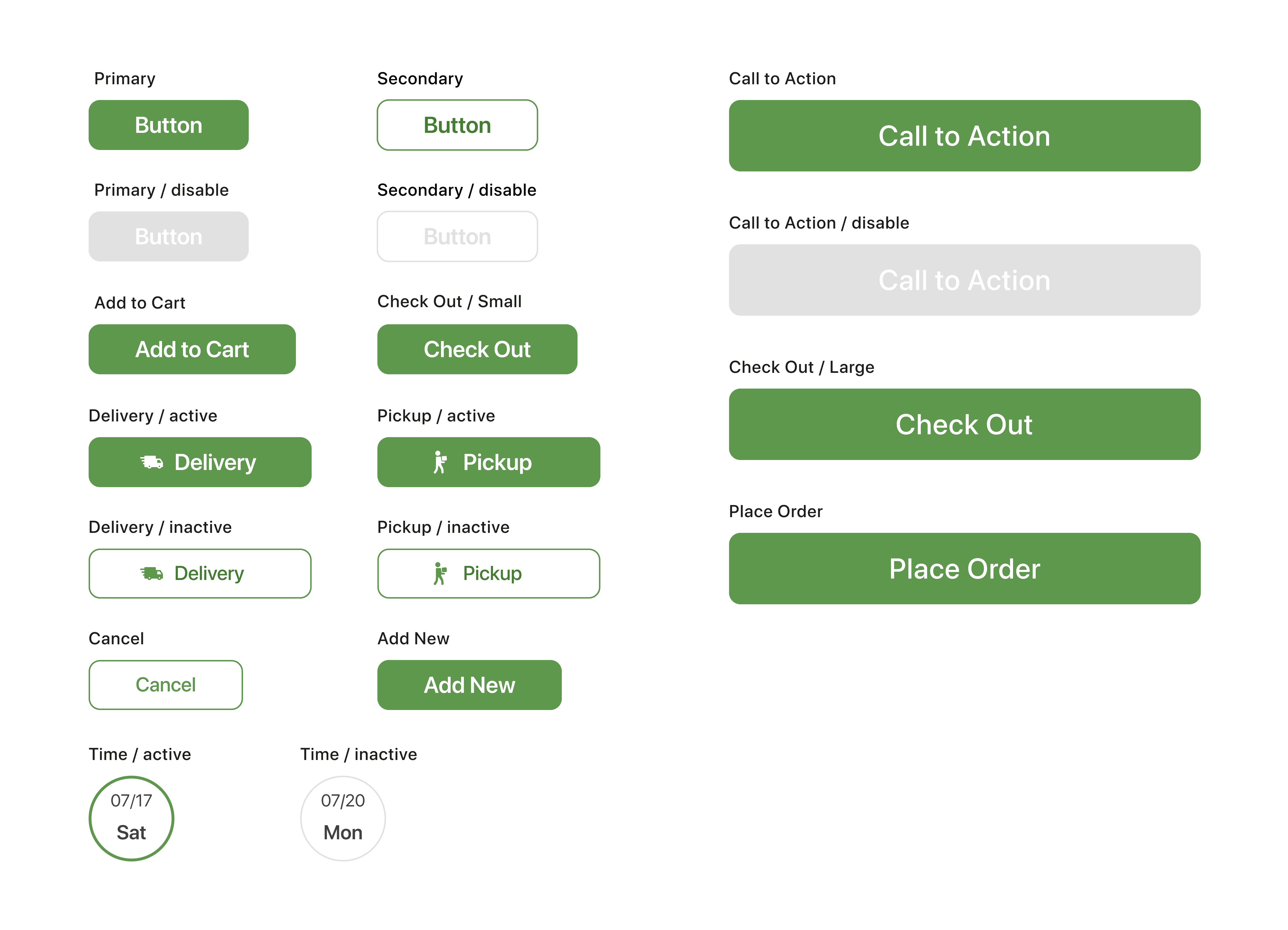
Components
Components

Retrospective
Usability & Accessibility
Usability & Accessibility
The usability testing process gave me more comprehensive understanding of how a product could play the impact on users and how the usability could affect dicision making. We also paid attention on accessibility in the process of redesigning the app including changing the color contrast, adjusting icon and components sizes.
The usability testing process gave me more comprehensive understanding of how a product could play the impact on users and how the usability could affect dicision making. We also paid attention on accessibility in the process of redesigning the app including changing the color contrast, adjusting icon and components sizes.
Product Branding
Product Branding
During testing, we found that some users are not clear about the product competitiveness and communication. So we implemented more branding concept in redesign and applied it to interaction design.